
skipieohhhhh
Fine art 3rd year, secondary research
41 posts
Latest Posts by skipieohhhhh
Andy Goldsworthy
https://doorofperception.com/2016/03/andy-goldsworthy-working-with-time/

Goldsworthy made work with snowballs, ice and natural materials, the melting process on watercolour paper echoing the processes in the natural world.
The drawings in this exhibition are made with snowballs, ice and natural materials from different locations: Borrowdale graphite, Borrowdale slate, Derwent water, Drumlanrig clay, Pit clay, and earth from the source of the Scaur River, Penport. The process of the snowballs melting on watercolour paper and forming the drawings echoes processes in the natural world: erosion, sedimentation, ice and flow. The visual structure and colour qualities thus produced are extraordinary.
The Ice and Snow Drawings have two main sources. The first Arctic Snowballs of 1989 resulted from an experience Goldsworthy had while out hunting with his Inuit guide Luti and his son. Coming across a breathing hole in the ice pack, Luti circled around at a distance, moving towards the hole, while his son stood ready with his gun in anticipation of the rising seal.
Dark blood dripped and trailed in the snow as the sledge moved off, carrying carcass and hunters. The seal was caught by the hunter’s instinct and knowledge of its survival habits.
The second source for the Snowball Drawings was an experience made by Goldsworthy following an exhibition at Glasgow’s Tramway. His large snowballs, which gradually melted during the course of the show, left an afterimage caused by the ‘impurities’ in the snowball.
On another occasion in the Arctic, Goldsworthy and his guides came across a polar bear’s tracks in the snow. Running parallel to this were the tracks of a mechanised skidou. Luti’s comment was simply: “dead bear.”
This experience of immersion in the natural world continues with the snowball drawings, but other questions arise. In the drawing with graphite from Borrowdale – one of the main sources for this material – there is a dual process: on the one hand natural, on the other with the artist’s participation. Who, or what, is making the drawing?
The oeuvre of artist Andy Goldsworthy utilises ‘found’ natural objects like leaves, rocks, ice and sticks to create captivating, often ephemeral interventions into the natural landscape that remind us of the power of natural beauty and the continuously changing seasons. Architectural writer Eva Menuhin discusses some of the traits in his work, which has recently become more monolithic yet is still concerned with movement, natural materiality and time, as seen in his work in progress ‘Hanging Stones’.

Gerhard Richter, Clouds, 1978
Andreas Eriksson
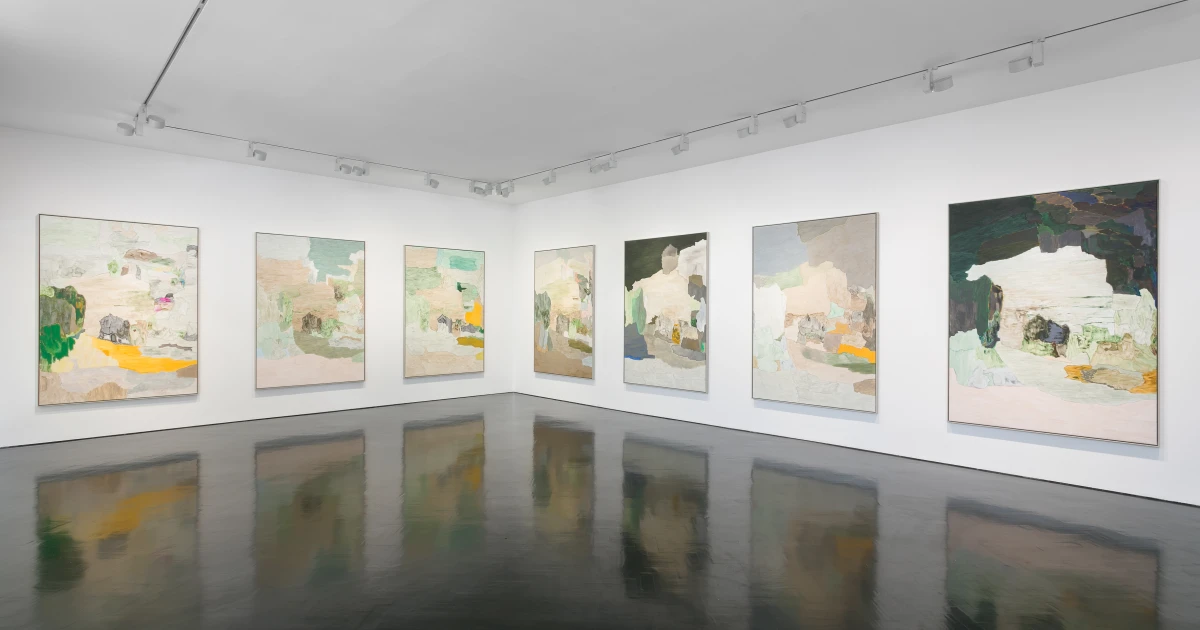
Hovering between abstraction and figuration, Andreas Eriksson’s meditative works can be interpreted as patchwork topographies or details of organic forms such as trees, earth and rock formations.
Eriksson’s artistic practice encompasses a wide range of media including painting, photography, sculpture, tapestry and installation. Rendered in earthy and botanical hues, his works are understated yet possess a poetic quality which has a lasting effect on the viewer. The emotional intensity of Eriksson’s work is the result of a sustained exploration of his response to the natural world.

Weissensee No. 12, 2018-2019
Linen
94 1/2 × 55 1/2 in | 240 × 141 cm
‘Weissensee No. 12’ is part of a recent series of large-scale handwoven tapestries by Andreas Eriksson. Rendered in subtle hues of undyed yarn, this body of work offers a unique window onto the artist's rural surroundings in Medelplana, Sweden. Eriksson sources the tapestries' linen from multiple sites in Sweden, linking each piece to a specific geographical location. Hovering between abstraction and figuration, this meditative work can be interpreted as a patchwork topography or a detail of an organic form. Tassels and loose threads hang freely from the surface, conjuring up associations with cascading waterfalls, patches of lichen and trees rustling in the wind. Variations in tone and structure between different types of yarn create striking modulations of light and depth, lending the work a painterly quality.
This new body of textiles expands the artist's formal language and demonstrates how he translates his paintings into tapestries
"It is impossible to trace any topography, scenery or perspective in Eriksson’s [works]. They have a strong hallucinatory power in that their lack of north- or southward orientation produces a disjunction, making it hard to understand where the sky and the ground lie."
– Filipa Ramos

Andreas ErikssonWeissensee No. 19, 2019
Linen
222 x 140cm (87 3/8 x 55 1/8in)


ASCII-Sarah

Emma Larsson
https://www.instagram.com/zebrakadebra/?hl=en


Emma Larsson (a.k.a. @zebrakadebra) is a Stockholm-based artist and illustrator. Her work strikes the balance between colorful dreamscape and inarticulable melancholy. Emma has evolved her practice to include expressive and organic watercolors, alongside paintings created with oil and acrylic. She describes her work as an ongoing exploration without rules and conventions, continually generating new forms, patterns and themes. Emma has collaborated with brands and agencies including Rachel Comey, Show Studio, and Winsor & Newton.
Swedish artist Emma Larsson known for her poetic, playful, and contemplative illustrations.

Eccentric Abstraction II - Framed, 2024
Watercolor and Mixed Media on Paper
Larsson’s work is characterized by a synergy between her, the materials, and an unknown presence she calls “force.


Even though she went to art school for a few years, between drawing, painting, and sculpting, she considers herself self-taught, an outsider, experimenting with all kinds of materials. She is a creative explorer. Her work is in constant flow. It can be described as poetic, playful, contemplative, intuitive and intriguing.
The creation comes from a flow of energy, memories of nature, and freedom Emma’s paintings are purely instinctive, they source from pleasure and freedom

The result is somewhat uncanny; abstract images which feel familiar and yet strangely unknowable, perhaps like beasts from the outer reaches of space, magnified microscopic fungi, or a not-quite-discernible dream motif. They are deeply appealing in a way that is hard to articulate. You work with watercolours, acrylics, inks and oils. What is it about mixing up these mediums that creates the effects you like? For me, the paper I use is as important as the paints; its structure, thickness and ability to absorb liquids all matter a lot to me. Every piece has several layers, as I add different paint after each drying session until it feels finished. Each painting takes a couple of days to complete but I always work on a set of multiple paintings simultaneously.
"I would describe my works as intuitive expressions. I rarely have a set idea when I start the process, so the outcome is always a result of experimenting."
On your Instagram, you say that you believe that there is “No beauty without strangeness”. Can you tell us a bit more about this? Beauty is important, but it is subjective. For something to be beautiful, it doesn’t have to be pretty. Personally, I’m not drawn to the “obvious beauty” we’re told to admire in the pages of fancy magazines. There has to be some flaw for me to feel interested; it’s the imperfection or the awkwardness that attracts me.

Her use of watercolor is quite the sight to behold as she expertly fuses colors together that seamlessly bleed into a delectable kind of complexion. The tints of color come together and meld into an organic melange that ebbs to the flow of the water utilized.
the use of symmetry
Larsson’s paintings incorporate this design element in most of her works but one can see there is a deliberate imperfection when mirroring the two sides of the painting.
Drawing inspiration from nature, one can notice some familiar forms such as flowers and birds.
Color field Painting

The term colour field painting is applied to the work of abstract painters working in the 1950s and 1960s characterised by large areas of a more or less flat single colour.
From around 1960 a more purely abstract form of colour field painting emerged in the work of Helen Frankenthaler, Morris Louis, Kenneth Noland, Alma Thomas, Sam Gilliam and others. It differed from abstract expressionism in that these artists eliminated both the emotional, mythic or religious content of the earlier movement, and the highly personal and painterly or gesturalapplication associated with it. In 1964 an exhibition of thirty-one artists associated with this development was organised by the critic Clement Greenberg at the Los Angeles County Museum of Art. He titled it Post-Painterly Abstraction, a term often also used to describe the work of the 1960 generation and their successors.
Buckling of paper

Watercolour paper warping occurs when the fibres in the paper absorb moisture unevenly, causing it to expand and contract in different places. The flat surface becomes warped and it dries stuck in this position
Let’s imagine that when you paint on your paper, you’re adding water to the top of it. Those fibres will expand, yet the underneath of the paper will be dry. This causes the top of the paper to lift up as it grows, while the bottom pulls under, creating an arch.
And if you create puddles of really wet patches when you paint, the surface will be wetter and drier in different areas, creating uneven warping.
As the paper dries, the fibres will decrease in size again, but the paper may remain a little warped.
Bonus: How to stretch your watercolour paper
Prep your paper by thoroughly wetting both sides in a layer of clean water. Lay out on a flat surface like a wooden board and pull and stretch the paper tight. Tape down the edges with strong painters tape, or staple it down. Allow to dry completely before painting on it.
Some artists swear by stretching their papers, but I find it difficult and fiddly to lift them off the board. You’d probably have to just cut the edges off next to the tape because it won’t peel, and this is too faffy for my impatient brain. But if stretching works for you, go for it and enjoy warp-free painting!
Kathy Prendergast
Intimate in tone and subject matter, Kathy Prendergast’s practice combines drawing, sculpture and installation. What might appear minimal or elusive at first glance can encompass a complex web of emotional, personal and political resonances. Proximate to the body and connecting subjective reflections on the world, her work explores a potent cluster of issues including power, identity, landscape, memory, geography, and family. A connection between the body and landscape, often manifested through mapping, can be traced back to the beginning of her practice. Often using redaction or removal as a device, creating negative space through black ink, coloured paint or white paper, the artist erases or overwrites geographic expressions of power. Prendergast points out the subjectivity of maps, their inherent colonialism, and the ultimate fragility of borders and territories over time. Though delicate, fragile and usually on a human scale, her works also point towards the infinite – suggesting the vastness of space or the constellations of the sky. Prendergast’s work is methodical – the product of slow, repetitive processes requiring patience, precision and devotion. Faithful to mark-making, drawing and hand-crafting as well as the revelatory potential of sparking unfamiliar connections with everyday objects, her work is enigmatic, eerily beautiful and emotionally resonant.


Throughout her career Kathy Prendergast has received international critical acclaim for her work with cartography

Kathy Prendergast’s Black Map series, from which these works are selected, are produced using printed motorist maps almost entirely obscured with ink. Tiny white spots that represent towns, villages, and cities pinpoint places of habitation and, up close, the place names, road numbers, and contour lines peer through the surface. From afar the ink appears opaque and the effect is that of a night sky dappled with strange and unfamiliar constellations.
Everyone loves a map, everyone loves a globe


The Lavit Gallery
exhibition report
Annual Members exhibition
27 February- 22 March
this exhibition is of artwork by the Lavit Gallery artist members.
It includes work with; print, painting, sculpture, photography, ceramics and textiles.
it has a wide range of artists from amateur to professionals
out of the 134 artists only 69 are exhibiting.
there is not distinct theme in this exhibition
Curator: unknown
location: Wandesford Quay, Clarke's Bridge, Cork
Installation and display: the installation was very traditional, large open space with white walls and everything was hung our put on a plint. the Lavit Gallery is a commercial galllery aswell so I imagine that the works where hung in a way to not only displayed but also sold.
some artists in the show are: pauline Angew, Jo Ashby, Patty Atkinson, Patricia Beran, Toni Boris.


Wangechi Mutu

“I create as a way of reinvigorating myself by replacing and reworking images and ideas that never fully represented me and the women and the people I was born from and who made me,” Wangechi Mutu has said.1 Born in Nairobi, Kenya, in 1972, the artist relocated to the US in the mid-1990s to study fine art. Her experience of migration and her diasporic identity have infused the artist’s creations with an expansive philosophy of belonging: “If a plant has just one root that doesn’t necessarily mean it’s going to stand straight and strong. The idea of having many roots, of having your feet really grounded in different places, is extremely empowering for me.”
Mutu is committed to reshaping the narratives of womanhood; by doing so, she challenges Western culture’s racist and misogynistic tenets
In her collages, sculptures, videos, and performances the figure of the woman is depicted with the complexity and profundity of a timeless archetype
As the artist explained the origin of her collage-making practice,
“I took these idealized stereotyped images of women and Eden-like ‘tropical’ images of Africa to create other images, tension-charged, potent, because they were full of my own emotional upset at the original ones…I was taking apart the images of a world that refused to acknowledge me.”

In Yo Mama (2006), the heroine—modeled after Funmilayo Anikulapo-Kuti, the Nigerian feminist and mother of the legendary Afrobeat musician Fela Kuti—embodies the role of Eve, the biblical first woman. She stands atop a beheaded snake, piercing its severed head with the stiletto heel of her boot. The serpent’s coiling body unravels placidly through the pink outer space, holding the two panels of the collage together as its tail wraps around a distant planet. Mutu’s cosmic composition utilizes the potent symbol of the snake in all its richness: the cunning creature associated with Eve’s damnation morphs into a mythical, celestial being whose dead body bridges two planets, while its wounded phallic form evokes oppressive masculinity. In Mutu’s retelling of this foundational tale, Eve defeats the snake and emerges victorious, taking control of her own story.
In Mutu’s practice, mixing materials through collage, bricolage, and montage is not a mere formal choice but a guiding principle of resilience and regeneration.


Alice baber
“When I first conceive of a painting, I must feel it, I hear it, I taste it, and I want to eat it. I start from the driving force of color (color hunger); then comes to a second color to provide light, luminous light. It will be the glow to reinforce the first color. I then discover the need of one, two, three, or more colors which will indicate and make movement, establish the psychodynamic balance in midair, allow freedom to take place, add weight at the top and bottom of painting, and create mythical whirlpools between larger forms.”
Alice Baber, Color, 1972
Alice Baber (1928-1982) was an American abstract expressionist painter, best known for the organic, biomorphic forms she painted using a staining technique which allowed her to explore pure color and elicit a sense of radiant light.
Baber’s stylistic development during the period between 1958 and the mid-1970s is characterized by a series of experiments with color and technique. Having turned to abstraction in 1958, she began exploring a monochromatic approach to painting, primarily using shades of red. By 1960 Baber came to add yellows, greens, and lavender to her work. She gradually incorporated a growing variety of colors into her canvases, a process that reached its hiatus by the mid 1970s when she finally introduced black to her work, achieving a new range of effects and subtleties.
Her evolving approach to painting is also characterized by her choice of materials. In the first half of the 1950s she worked primarily in oil, but soon began to dilute her paint in order to emphasize the different shades of color, eventually expanding her practice to include also acrylic on canvas and watercolors on paper as alternatives to oil. Watercolors in particular lent themselves more easily to her growing interest in transparency and luminosity, as well as her interests in joining light and color in a kinetic fusion. Baber also worked with acrylic. Working in both mediums in parallel led to discoveries that altered the course of Baber’s painting, a method of ‘sinking’ (or ‘staining’) and ‘lifting’ to create abstract, organic forms – a visual style that has since become her signature. Color would remain central to the artist’s practice throughout her career, a theme on which she wrote at length in several publications, and which became the subject of exhibitions the artist curated, including Color Forum, a large-scale group exhibition held at the University of Texas, Austin, 1972.


Post-war feminist artist and lithographer Alice Baber produced brilliantly colored abstract expressionist oil and watercolor paintings by staining her canvases with rounded biomorphic forms. Using a technique of pouringdiluted oil paint onto a canvas in layers, she sometimes experimented with variations of a single hue and at other times created a purposeful interplay of different tones, as in The Song of the Wind (1977). Baber referred to her attempts to relay feelings through color as a “color hunger,” and exploration of “the infinite range of possibilities.” A member of the cooperative March Gallery in downtown New York, where she held her first solo exhibition in 1958, Baber was married to noted Abstract Expressionist painter Paul Jenkins. Baber’s work can be found in the collections of the Met, the Whitney, the Guggenheim, and the National Museum of Women in the Arts.

Wheel of Jaguar, 1982
Watercolor on Paper 12 × 11 in | 30.5 × 27.9 cm

The Light Inside the Mountain, 1978
Oil on canvas 33 × 55 in | 83.8 × 139.7 cm

Just Arrived, 1962
Oil on canvas 57 × 44 in | 144.8 × 111.8 cm

UNTITLED
watercolor on paper, 22 x 30 IN unframed, 33.5 x 41.5 IN unframed

Alice Baber - Ladder Sun Dance

Alice Baber

Alice Baber (American, 1928-1982), The Light Inside the Mountain, 1978. Oil on canvas, 32 7/8 x 55 in.
Paul Jenkins
The paintings of Paul Jenkins have come to represent the spirit, vitality, and invention of post World War II American abstraction. Employing an unorthodox approach to paint application, Jenkins is as much identified with the process of controlled paint-pouring and canvas manipulation as with the gem-like veils of transparent and translucent color which have characterized his work since the late 1950s. Born and raised in Kansas City, Missouri in 1923, Jenkins later moved to Youngstown, Ohio. Drawn to New York, he became a student of Yasuo Kuniyoshi at the Art Students League and ultimately became associated with the Abstract Expressionists, inspired in part by the "cataclysmic challenge of Pollock and the total metaphysical consumption of Mark Tobey." An ongoing interest in Eastern religions and philosophy, the study of the I Ching, along with the writings of Carl Gustav Jung prompted Jenkins' turn toward inward reflection and mysticism which have dominated his aesthetic as well as his life.

Paul Jenkins (b. 1923, Kansas City, Missouri, d. 2012, New York, New York) was an American painter who is celebrated for his dynamic abstractions in oil, acrylic, and enamel. His paintings are characterised by their masterfully controlled, multilayered washes of pigment that meet on canvas in oceanic pools and eddies. While the artist’s work was initially received in the terms of American Abstract Expressionism, his sustained, rigorous inquiries into the physiological and spiritual aspects of colour, what the artist termed its “phenomena,” opened it to new avenues of expression that would outlast numerous movements throughout his six-decade career.
Coming to artistic maturity in New York at Abstract Expressionism’s height, Jenkins befriended many of the movement’s leading figures before decamping to Paris, which would serve as his second base of operations for the rest of his life. In Paris the painter established the conditions for his now-celebrated process, in which pigments are coaxed along the surface of a canvas that has been primed and buffed to a silken plane. By manipulating the angle of the surface on which paints traveled and by guiding their movements with an ivory knife, Jenkins produced a body of work that is striking for the singularity of its maker’s conviction while evidencing his spiritual restlessness and continual seeking.

Phenomena Umbra
1982
Watercolour on paper
31 ¼ x 43 ¼ in. (79.4 x 109.9 cm)
Framed: 33 x 45 ½ in. (83.8 x 115.6 cm)

Phenomena Noh Veil
1969
Acrylic on canvas
39 ⅛ x 39 ⅛ in. (99.1 x 99.1 cm)


Paul Jenkins (1923-2012) is a major artist in post-war abstraction whose work is recognized for its luminous flows of color combining opacity and transparency to both emanate and reflect light. An early pioneer of poured paint, Jenkins worked on paper and primed canvas. His paintings have achieved prominence for the fluidity of their forms as well as their gem-like veils of color which have characterized his work since the 1950s. Full of verve with a profoundly spiritual aspect, his paintings have a natural feeling to them, with rarely any trace of the artist’s hand. “A painting” he said, “should be a world not a thing.”
Jenkins made his vibrant compositions by pouring paint directly onto the canvas, then tilting it so the paint dripped, bled, and pooled into fluid, diaphanous washes that resembled ceramic glazes.
His palettes and methodologies can evoke the experiments of fellow abstract titan Helen Frankenthaler.

Phenomena Emanation of Host,,
1989
Watercolour on paper
43 3/10 × 31 in | 110 × 78.7 cm

Phenomena Set the Compass,
1994
Watercolour on paper
43 3/10 × 31 1/10 in | 110 × 79 cm

“It is a presumption on my part but after all, that is one of the expanding possibilities of Abstract painting: that which makes something felt which is not explicitly seen.”
Yahoo Hortal
https://yagohortal.com/
Most artists actually think in terms of light and dark, and not so much color. But, Yago, you’re a colorist too" Peter Halley
Yago Hortal (Barcelona, 1983), studied Fine Arts at the University of Barcelona and the University of Seville. In 2007, one year after graduating, he wins the 49th Prize for Young Painters. The following year, at only 25 years of age, he began to exhibit not only in Spain but also in the rest of Europe and the United States. His paintings maintain a tight relationship between the work of art and action painting itself. The canvas forms part of a performance in which the artist consciously creates spontaneous color forms in an infinite gamma, expressing passion and vibrancy. The painting seems to come out of the canvas, causing a desire to touch it and creating textural sensations.
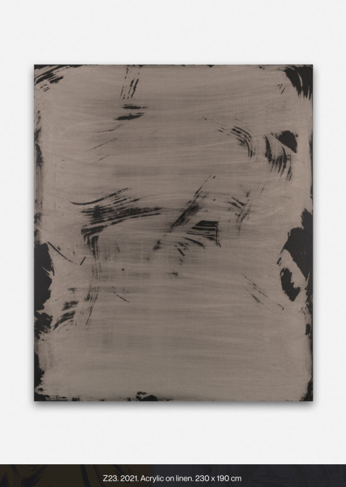


Yago Hortal paints in vivid, sometimes fluorescent acrylics, smearing, marbling, and splattering the material in thick, abstract brushstrokes onto large-scale white canvases that pop with color. Hortal works on several paintings simultaneously, responding to the colors both impulsively and with premeditation, and often letting the paint drip down the canvas.
“I look for a balance between chaos and order,” he has said, “something like a combination between a chess game and a boxing match.”

Z85, 2024
Acrylic on linen23
3/5 × 19 7/10 in | 60 × 50 cm

Giant, sweeping waves and splashes of thick paint flood our souls in vibrant colour. Inspired by Abstract Expressionism, the art of Yago Hortal has a direct connection with the viewer, creating sensations that balance between chaos and order. The contemporary artist paints with spontaneous yet also planned action. Brushstrokes that smear, marble, and splatter, recreate the face and personality of colour in our contemporary age.
Yago Hortal was born and raised in the city of Barcelona. He uses industrial colors and materials that reference an urban experience. Within his studio, he listens to different music genres that mould his emotional state before painting. As energy flows onto the canvas, it is captured and preserved as a physical signature.
“What matters to me is that the rhythm of each brushstroke can be reflected in a single gesture…each brushstroke acting as a reflection of the moment it was made. That’s why all my paintings are also a kind of personal diary.” - Yago Hortal
characterized by its intense and vibrant chromaticism.
“ I am known for very gestural artwork, very liquid, with a very marked gesture, very clear, as well as a very thick density and exuberant color.”
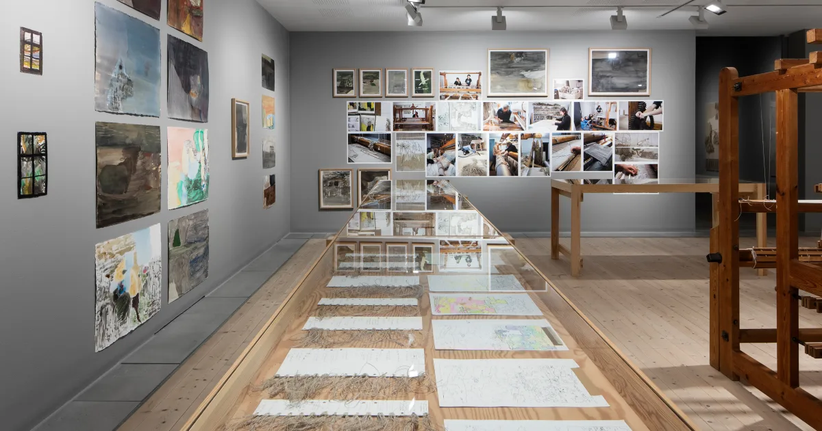
Issy Wilson

https://www.instagram.com/iwilson.art/?hl=en
Issy Wilson is a London-based artist originally from Chicago. Her practice is deeply rooted in the natural world, with a focus on drawing, painting, textiles, and research. She gathers inspiration by observing her surroundings from the seemingly mundane to the extraordinary: noticing water stains on pavement and moss in the cracks of city bricks to the breathtaking views of the national parks and ancient forests.
Her work explores the structures of roots, trees, mycelium, lichen, and mosses, examining how they mirror blood vessels, neurons, rivers, and mountains in their search to form strong organic connections. Her art studio has become an ecosystem of its own, with pieces evolving symbiotically.
Materials: ink, tea, emulsion, cheese cloth, acrylic, pea, canvas, pastels.

Ecdysis
ink, tea, and emulsion on canvas, 186x300cm, 2024

Ecdysis detail

Limestone I
ink and emulsion on canvas, 150x250cm, 2024

Limestone II,
ink and emulsion on canvas, 150x150cm, 2024
Exhibition 2

The gallery has a number of exhibitions, but I mainly focused on the Amie Siegel exhibition and the exhibition from Christopher Mahon.
By Christopher Mahon.


VISUAL is pleased to present Sincere, or what you will, a solo exhibition by Irish artist Christopher Mahon.
Mahon works across a range of media including sculpture, painting, photography, installation and performance, and his practice is notable for the variety of disciplines and materials used. He has worked with actors and dancers to create site-responsive environments that combine the mundane and theatrical, and often incorporates found objects in the finished piece.
For several years Mahon has maintained a studio in Cairo, Egypt, basing much of his sculptural production on the techniques and capabilities of the small industrial workshops – the foundries, metal-, stone- and wood-working studios – that dot the city’s backstreets.
Mahon’s sculptures occupy the unstable space between lyricism and materiality, the concrete and ineffable. His materials reference the form and patina of everyday objects and their archaeological forebears. Figurative and decorative elements – carved stone arms, cast brass urns, found textiles – speak to both the historical context and daily domesticity. His material language embraces the mechanical detritus of the modern metropolis. Once functional objects now beyond repair, furniture so broken that no one will give it houseroom. The twisted fragments, nuts, bolts, cogs, pipes, of an obsolete infrastructure are repurposed or recreated so they can play their part as elements in a newly finished work.
Take BAI GAMAYKA, a key work in Sincere, or what you will. The seemingly meaningless set of brass sans-serif letters mounted on the wall reproduces the sign that hangs above one of Cairo’s few remaining downtown bars. The cursive flourish of the r fell off long ago and there is no soft g in colloquial Egyptian pronunciation. Bar Jamaica/BAI GAMAYKA hangs opposite The Sky so Blue, a scrawled handwritten phrase that has been recreated in outsized aluminium letters that hang floating in space; half-baked poetry facing off against a hard-bitten bar.
The exhibition’s title Sincere, or what you will foregrounds the artist’s interest in the ambiguous, the porous, the making things whole anew, if only temporarily. While it is now widely accepted that sincere derives from the Latin sincerus meaning clean, pure, sound, a common folk etymology has it that sincere is derived from the Latin sine, without, and cera, wax. The phrase was used to describe a perfect marble sculpture with no cracks needing to be filled with wax to trick unwary buyers. “or what you will” is drawn from the full title of Shakespeare’s Twelfth Night, a romantic comedy replete with love triangles and protagonists in disguise. The play was written to be performed on the twelfth night of Christmas or the feast of the Ephiphany, a holiday that shifts around the calendar depending on the Eastern or Western Christan tradition, and which now marks the boundary between an extended holiday period and the imminent return to work.
This exhibition, too, exists on the boundary between places and times both real and reimagined, where memories and materials can appear and dissolve and reappear anew.
Sincere, or what you will is co-curated by Benjamin Stafford (VISUAL) and Rachael Gilbourne (IMMA, RGKSKSRG). A text by Gilbourne, An Ode to Spring, from the End of Winter, to the Start of Summer, accompanies the exhibition and is available here and at the gallery.
Christopher Mahon is an Irish artist and the work for VISUAL was produced in his studio in Cairo. He attended the École Jacques Lecoq Movement Research Laboratory, Paris, holds an MA in Art and Research Collaboration from IADT and was a resident at the Rijksakademie, Amsterdam 2018–2019. Mahon has exhibited in Ireland and internationally. Projects include Paris Art Book Fair, Palais de Tokyo, Paris (2024), Aswan International Sculpture Symposium (2021), Rijksakademie Open Studios, Amsterdam (2019), Le Menagerie de Verre, Paris (2019), Townhouse Gallery, Cairo (2019), RGKSKSRG Cribs, Dublin (2019), Double Negative, ARKO Art Centre, Seoul (2018) and Active Archive, Project Arts Centre, Dublin (2018). Mahon’s work is held in private and public collections in Ireland, Europe and North America.
By Amie Siegel

VISUAL is pleased to present Asterisms, a solo exhibition by Amie Siegel. Siegel is an American artist who lives in Brooklyn, New York, and works across film, video, photography, sculpture, painting and installation.
Asterisms is both a moving-image work and a sculptural installation, its uniquely star-shaped wall of overlapping images built to a scale the artist proposed in response to the architecture of VISUAL’s Main Gallery. An asterism is a loose collection of stars that form a pattern, similar to but smaller than a constellation. This notion of disparate elements combining to form a complete image is key to both Asterisms itself, and to Siegel’s practice in general, in which deep research produces artworks that address cultural, political and social questions.
The setting and context of Asterisms is the United Arab Emirates, a place that has modernized at a rapid pace, built on wealth originally derived from ownership of natural resources. Throughout Siegel’s cinematic work the viewer encounters images of factories, labour, commerce, leisure, technology, humans, and animals. These elements are interwoven in the artist’s careful montage and in the various cinematically-scaled geometries that build and layer over time, both in their accumulation of meaning but also as the images dynamically overlap and connect on the star-shaped wall. Horses play a role in the work, and are seen stabled in luxurious accommodation, in sharp contrast with the conditions in which migrant labourers live and work. Horse’s flanks echo the shape of sand dunes and seem to merge with the landscape. The material of that same desert landscape – sand – is everywhere; kicked up into dust by hooves, encroaching on buildings, filling the doorways and windows and almost totally burying houses. Sand is dumped onto artificial islands, to arrest their rapid erosion back into the sea.
These artificial islands comprise a development designed to mimic a map of the world when viewed from above. Despite having once been a flagship project of the Emirate of Dubai, they are no longer promoted by the government. They hide in plain sight, simultaneously visible and invisible. In one of the later shots in Asterisms, the camera zooms out from a party on one of the islands, where a crowd drinks and dances by a swimming pool. As the partygoers recede into the distance, the lights of the sole inhabited island in a sea of dark ones makes them appear as distant and alone as a star hanging in a night sky.
-
On show in VISUAL’s Digital Gallery is Siegel’s RM, a series of photographs of radioactive minerals. This group of works allude to Asterisms both in their constellation-like display, individually illuminated in a darkened space, and their own almost astral representations, glowing gently in dark matter. Many of the minerals Siegel photographed are pseudomorphs, or “false forms”, an occurrence where one mineral’s substance is entirely replaced by another while retaining its outward physical appearance. In each of these differently scaled works, the inherent danger of the radioactive material contrasts with their jewel-like colours and forms, their true nature disguised.
Alongside these works Siegel presents Listening to the Universe (2014), a work-on-paper and act of montage derived from the artist's collection of science and space museum postcards, presenting the vacuum of sound that is outer space, and our continual efforts to listen, or know, our sphere and beyond.
Asterisms is a commission of the Fundação Bienal de São Paulo, Brazil and VIA Art Fund. Additional support by KTLO, Los Angeles.
-
Amie Siegel (b. 1974, Chicago, IL) is a visual artist working variously with film, video, photography, sound, performance and installation. She is known for her layered, meticulously constructed works that trace and perform the undercurrents of systems of value, cultural ownership and image-making.
Recent solo exhibitions include Panorama, Carnegie Museum of Art, Pittsburgh (2023); Bloodlines, Scottish National Museum Gallery of Modern Art (2022); The Silence, ArkDes, Stockholm (2022); Medium Cool, Blaffer Art Museum, Houston (2019); In Focus: Amie Siegel – Provenance, Tate St. Ives (2018); Winter, Guggenheim Museum Bilbao (2017); Strata, South London Gallery (2017); Double Negative, Museum Villa Stuck, Munich (2016); Ricochet, Kunstmuseum Stuttgart (2016) and Imitation of Life, Temple Bar Gallery, Dublin (2016). She has participated in the 34th São Paulo Bienal; 12th Gwangju Biennial; Dhaka Art Summit, Bangladesh; Glasgow International, Scotland; 5th Auckland Triennial, New Zealand; and the Whitney Biennial, among numerous other group exhibitions.
Siegel’s work is in the permanent collections of The Museum of Modern Art, New York; Tate, London; Carnegie Museum of Art, Pittsburgh; The Art Institute of Chicago; Kunstmuseum Stuttgart; Auckland Art Gallery, New Zealand; MAK-Museum für Angewandte Kunst, Vienna; The Metropolitan Museum of Art, New York; Whitney Museum, New York and the Solomon R. Guggenheim Museum, New York. Her films have screened at the Cannes, Berlin, Toronto, Rotterdam and New York film festivals. She has been a fellow of the DAAD Berliner-Künstlerprogramm and Guggenheim Foundation, a Fulton Fellow at The Film Study Center at Harvard University and a Smithsonian Artist Fellow. Siegel has received numerous grants and awards including from the Sundance Institute, Princess Grace Foundation, ICA Boston (Foster Prize), Creative Capital, Anonymous Was a Woman and the Foundation for Contemporary Arts, New York. In 2023 she was an Artist-in-Residence at the Yale Center for British Art, New Haven, CT.
Exhibition

23rd of October


They have a private collection upstairs, They also have on going o'Malley collection that is on show.
Ciara Roche, The 'honeymoon' exhibition
12th oct- 1st Dec
This exhibition takes place in there largest area, the main gallery.
Butler Gallery is very pleased to present an exhibition of new paintings by Wexford-born artist Ciara Roche. This is the artist’s first large-scale museum exhibition in Ireland.
This suite of paintings on canvas and paper refer to domestic scenes and public places with source imagery derived from the artist’s own photography, film stills and found imagery. Roche continues to explore representational image-making using wet and quickly applied oil paint to create a sense of luminosity and movement on the surface. The paintings explore places and themes that range from exclusive anonymous hotels to empty 24-hour cafés.
For this exhibition, Roche has embraced new challenges and created her largest paintings to date. The process, she says, was akin to learning a new language. The paintings were realised by translating her smaller sketchbook sized works onto a substantially larger framework. Figuring out materials and brushes that worked well for this new format took a while to master but the resultant paintings have been achieved with great skill and an acute awareness on how far to push things.
The Late Lounge, Roche’s largest painting to date, is both an interior and a window out to a city scape. We are invited to step into a high end restaurant, or perhaps it is a bar, complete with grand piano, and insulated against what might be happening in a corporate blue city beyond. Glass Table, like many of the paintings on view, presents more questions than answers: who sits here and what schemes are conjured up around this glass table? People are purposely missing from these paintings; the viewer is encouraged to insert themselves into the scene and create their own narrative.
There is frequently an unease in Roche’s paintings, a sort of critique of this hugely capitalistic world we live in. She is often struck by the dark side of scenarios and says that her solution is ‘to paint those fears, acknowledging the things that might happen, like exploring different versions of my life’. Viewing the works in this exhibition is like entering an uncanny world of suspense made up of light and shadow. These lushly rendered paintings, either small or large, capture timeless moments for the viewer to ponder. The rewards are wonderful.
curated by: Claire Keegan
"I don't paint people into my paintings because if I were to put a figure in them, then it would feel like the viewers couldn't go in and imagine themselves in that space... I like the idea of being able to let your mind wander and fill in the empty spaces".


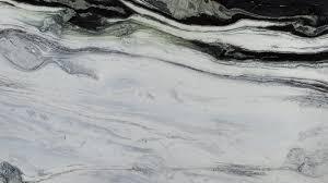
Marbling
The quality of a surface that has streaks of color, like marble

The patterns are formed by first floating the colors on the surface of a liquid, and then laying the paper or fabric onto the colors to absorb them.
looking through ancient volumes full of arcane recipes for mixing such exotic ingredients as Irish moss seaweed, spirits of green soap, and distilled bile from the gall bladder of an ox.
They were used for decorative purposes, and also as a background for official documents and signatures, to prevent erasure and forgery.
The traditional marbling inks were just not durable enough to stand up to washing. Now, though, fine marbling can be done just as easily on cloth as on paper with these new paints, and modern colors are much more vivid and brilliant and long-lasting than ever in the past.
Stone Marble: Gives the effect of real marble. Stone marbles are the simplest patterns, but they often take longer to make than the more complex combed patterns, because so many thousands of tiny droplets of color must be applied.

Marble
Marble is metamorphosed limestone, quartzite is metamorphosed sandstone, and gneiss, another common metamorphic rock, sometimes begins as granite.

Metamorphic rocks are sedimentary or igneous rocks that have been transformed by pressure, heat, or the intrusion of fluids. The heat may come from nearby magma or hot water intruding via hot springs. It can also come from subduction, when tectonic forces draw rocks deep beneath the Earth's surface.

Dorothea Rockburne, "D" Study for Scalar, (chipboard, crude oil, paper and nails), 1970 [Craig Starr Gallery, New York, NY. © Dorothea Rockburne / ARS, New York]
Exhibition: Dorothea Rockburne: Works 1967-1972, September 7 – October 20, 2012
Sediment

Rock salt, also known as halite, forms as oceans evaporate. Oceans are made of salt water. When the water enters the atmosphere as vapor, it leaves the salt behind. The Bonneville Salt Flats, in the U.S. state of Utah, are flat desert areas covered by a layer of rock salt sediment. Lake Bonneville, the ancient seathat once covered the area, has long since evaporated.


SALT OF THE BAY
“I’m fascinated and drawn to these shapes and colors at sunset,” says Your Shot member Jassen T., who captured this aerial image of a salt marsh in northern California’s San Francisco Bay. “It’s a very unique and photogenic area.”

Muriel Napoli

Nature 391 painting
Acrylic on Canvas 100 by 140 cm

Nature 377 Painting
Acrylic on canvas 160 by 100 cm

Nature 362 painting
Acrylic on canvas 80 by 80 cm
My paintings are a tribute to nature's unwavering spirit of transformation, untouched by human intervention, from the dawn of time to the present day. The mighty oceans and their formation, the arrival of life-sustaining water, the laying down of sediment, the fiery fury of magma, the creation of coal, the birth of celestial bodies, accretion, geological wonders...these are but a few of the subjects I seek to illuminate. Through the harmonious blending of organic and mineral elements, I strive to evoke nature's symphony of change. In my art, I aspire to strip away all that is artificial, the vestiges of human tampering, and present a celestial vision of the natural world, pure and unblemished.
Artist Statement What is found in my pictures is nature's ability to change independently of the action of humanity, from its origins to today. The formation of the oceans, the origin of water on Earth, sedimentation, fire, magma, formation of coal, of planets, accretion, geological phenomenon ...I mix organic, mineral, the elements and various displays of these elements. I eliminate, as much as possible, everything that humanity has added to the world, all the changes introduced, everything which is artificial. My work tends to connect the world to beings and things, to form a whole, an entirety.

Muriel Napoli is a talented French painter whose works have been exhibited in USA, Italy and France. Seeking to remove elements of pure superficiality or attractiveness, she creates impactful abstract works marked by a unique colour combination, sweeping shapes and a striking sense of space.
What is found in the paintings of Muriel Napoli is the capacity that the nature of transforming independently of the action of man, from origin to the present. Formation of oceans, origin of water on earth, sedimentation, fire, magma, coal formation, planets, accretion, geological phenomena ... "I mix the plant, the mineral, the elements and the different manifestations of these elements. I make the most of everything that man added to the world, all the transformations brought by him, which is artificial. My work tends to link the universe to beings and things, to form a whole, a whole. "
lyrical abstraction

Passing on her emotions, feelings, transitional ideas that materialize on canvas through flat tints of the material, oil, knife directly positioned on the floor, on the frame, without any reference to reality itself.
"My ambition is to lead the viewer to think, to meditate, perhaps to dream"

Installation view 2021

Muriel Napoli, an abstract painter with a passion for the beauty of nature, recently embarked on a remarkable artistic adventure in Vietnam. During her one-month artist residency program in Ho Chi Minh City, she was captivated by the astonishing richness of Vietnamese nature. Today, we invite you to join us on a three-minute artistic exploration with Muriel as she shares her techniques and the deep inspiration she drew from this awe-inspiring environment.
Muriel’s artistic process is a harmonious blend of instinct and technique. She meticulously selects her materials, ensuring they can capture the essence of the natural world she seeks to convey on her canvas. With a palette of fluid and vibrant colors, she sets out to create a visual symphony that celebrates the simplicity and beauty of the Vietnamese landscape.
Muriel’s dedication to capturing the essence of nature goes beyond the visual realm. She strives to infuse her paintings with the very essence of the flowers, fruits, and vegetation that so inspired her. Through texture, layering, and the interplay of light and shadow, Muriel breathes life into her art, inviting viewers to immerse themselves in the beauty and serenity of the natural world.


Nature 326
Christopher Wool

Christopher Wool is best known for his paintings of large, black, stenciled letters on white canvases, but he possesses a wide range of styles; using a combined array of painterly techniques, including spray painting, hand painting, and screen-printing, he provides tension between painting and erasing, gesture and removal, depth and flatness. By painting layer upon layer of whites and off-whites over screen-printed elements used in previous works—monochrome forms taken from reproductions, enlargements of details of photographs, screens, and Polaroids of his own paintings—he accretes the surface of his pressurized paintings while apparently voiding their very substance. Only ghosts and impediments to the field of vision remain, each fixed in its individual temporality. Through these various procedures of application and cancellation, Wool obscures the liminal traces of previous elements, putting reproduction and negation to generative use in forming a new chapter in contemporary painting. His paintings can therefore be defined as much by what they are not and what they hold back as what they are.
Wool has forged an agile, highly focused practice that incorporates a variety of processes and mediums, paying special attention to the complexities of painting.

Untitled, 2012
Silkscreen ink on linen 120 by 96 inches

...Stupid Rabbit, 2004
enamel on linen 96by 72 inches

Give it Up or Turn It Loose, 1994
Enamel on aluminium 78 by 60 inches

A central tenet of Christopher Wool’s (b. 1955) practice is the very process of painting itself. This has been explored and developed since his early years through reducing form and colour, as well as experimenting with different painting styles and reproduction techniques, such as silkscreen or pattern rollers, overlaying and erasing, covering or obscuring with paint, and adding layers on top. The range of techniques Wool has used over the years makes reference to the processes and gestures that have marked contemporary art history. The artist’s complex work encourages the viewer to reflect on the physical qualities of paint and various modes of reproduction, while honing an awareness of painting procedures and the essential elements of the medium: colour, form and line.
‘Christopher Wool’s paintings seem to capture visual urban experience, carved out of a moment for the duration of an artwork – an artwork that coverts the structures of experience into the structures of painting. Non-specific moments and impressions are lifted out of context and fixed into details of a painting that, unlike graffiti, conveys the speed and concentration of its origin only when it is contemplated over a measure of time in an art space. The dynamic of the picture’s conception becomes, very gradually, the dynamite of the thought it contains. Thought pictures.’
Christopher Wool’s paintings and prints explore the confluence of image, text, and pattern. They often feature enigmatic, confrontational found phrases or illegible scribbles, which are either stencilled or plastered in black across flat white fields. The artist occasionally covers the compositions with spray-paint marks and screen-printed elements (some taken from his previous works), erasing and relayering as he goes. His process—which focuses on the possibilities of reproduction, appropriation, and accretion—is as important as the results themselves. Wool studied at Sarah Lawrence College and the New York Studio School. New York’s vibrant 1970s downtown No Wave and punk scenes became major influences, and Wool reached his mature style in the mid-1980s. Wool has exhibited in New York, Los Angeles, Chicago, London, Paris, Tokyo, Berlin, and beyond, and his work belongs in the collections of the Museum of Modern Art, the Centre Pompidou, and the Tate. His work has achieved eight figures on the secondary market.


Untitled 1988
Enamel and flash on aluminium 96 by 72


Sam Gillan

Watercolour, 4 1969
Watercolor, and aluminum powder on fiberglass paper 23 3/4 x 18 1/8" (60.3 x 45.9 cm)
Blurring the boundaries between painting, sculpture, and installation, Sam Gilliam wrestles with the physicality of the art object and its relationship to the viewer.
he moved to Washington, DC, during the formation of Color Field painting, which emphasized the use of flat planes of color and novel paint application techniques.
Gilliam soon experimented with color, form, and technique, pouring pigments and folding canvases while still wet.
remove his canvases from their stretchers entirely, and, inspired by laundry on clotheslines, hang them from the ceiling or walls.
Gilliam transformed painting into something sculptural and three-dimensional, disrupting traditional modes of presentation and viewing.
He also incorporated metal forms, alternative materials like yarn and glitter, varied applications of paint, and quilt-inspired patterning into his practice.
“the expressive act of making a mark and hanging it in space is always political. My work is as political as it is formal.”

Sam Gilliam, Green April, 1969,
acrylic on canvas, 98 x 271 x 3 7/8 inches (248.9 x 688.3 x 9.8 cm), Collection of Kunstmuseum Basel, Basel, Switzerland, Courtesy of David Kordansky Gallery, Los Angeles, photography by Lee Thompson.
his lyrical abstractions took on an increasing variety of forms, moods, and materials.


Water Lilies painted by Claude Monet (1840 - 1926)

* * *
“I’d rather risk an ugly surprise than rely on things I know I can do.”
- Helen Frankenthaler.
